
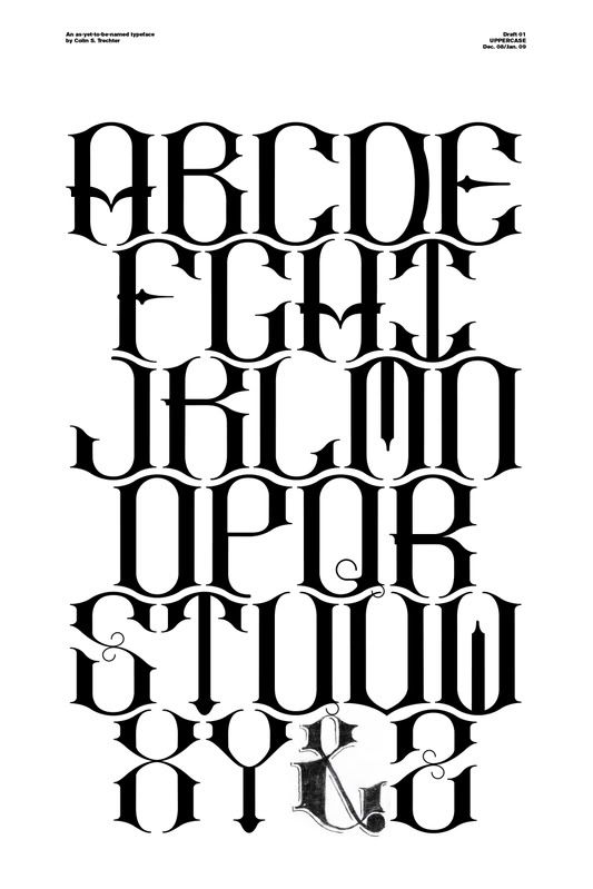
This is a mono-spaced typeface whose similar outline / characteristics allows for (what I hope to be) interesting combinations and play via kerning and leading.
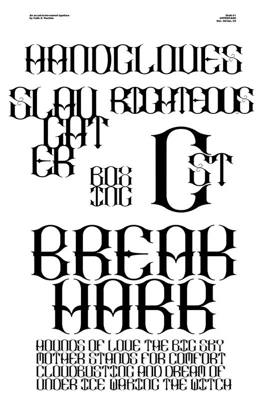
The first phase of this as-yet-to-be-named typeface is done. These are vectors, not yet type-able and not as refined as I'd like them to be/as they will be. This has been quite the learning process. If I can get these usable shortly after school starts (just this weight, and just the uppercase) I'll be satisfied with this as a winter-break project. I feel like I might have as much time left (refining & tweaking) as I have already spent constructing.
4 comments:
This is looking real fucking nice. character are starting to look tight. congrats c-dog
SOOOOOO GOOOOOOOOD!
The leading is stunning! I'd like to see a few words stack on top of each-other printed HUGE!
i really love the 'P'! impressiveeeeee, keep it up
Post a Comment